

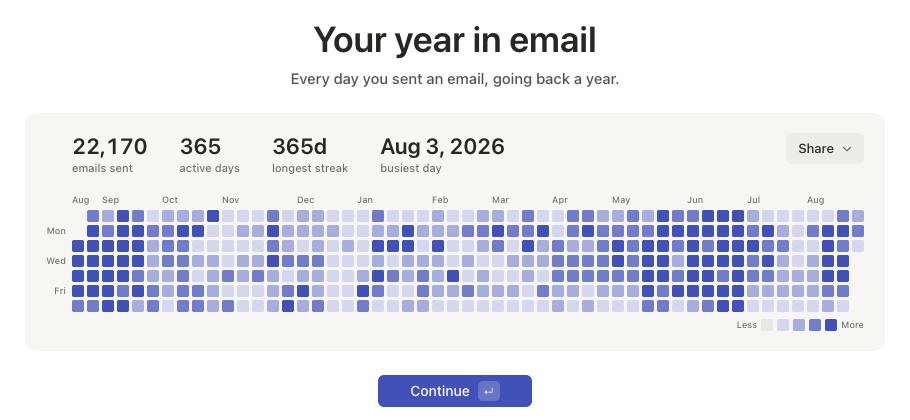
Sharing it
Click Share above the graph for Copy link, Post on X, or Share on LinkedIn. The graph is private until you share it; any of the three options publishes a link anyone can view.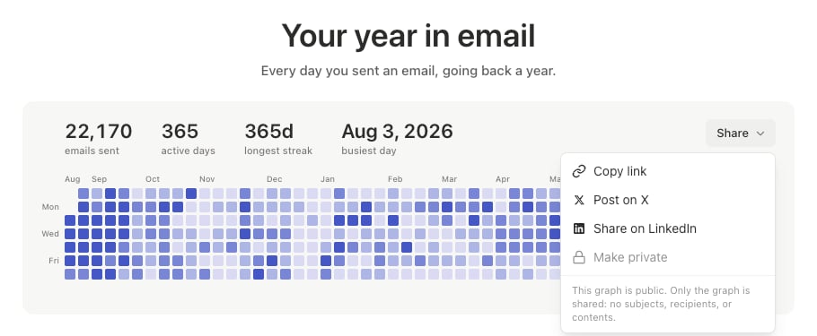
Only the graph is shared: no subjects, recipients, or message content.
If you don’t see it
The graph needs at least one sent email in the past year to have anything to draw. A brand-new account sees “Nothing to show yet” instead, and the graph fills in as you send. This step appears once, during onboarding. If you shared your link, save it or repost it if you want to keep pointing people to it. Slashy doesn’t currently offer a way to reopen or reshare an unpublished graph after onboarding.Your first week
What to expect through onboarding and your first week.
Referring friends to Slashy
Share your personal invite link.
AI privacy
How your data is handled.